
BLOG
The Digital Contact Sheet :: Episode 8
X100F 23mm f2 - 1/150, f2, ISO 200
This Digital Contact Sheet and the next one will be from the same documentary shoot, but with very different pictures. The theme is life-changing surgery and it’s from a project back in 2019. I won’t rehash the details of the story here but you can read all about it by clicking HERE

I tend to shoot with two (sometimes three) cameras for documentary work. For this shoot, I had the Fujifilm X100F and the X-Pro2. The X100F has a fixed 23/2 lens and I was using a 35/2 and 50/2 on the X-Pro2. With the 1.5x crop of the APS-C Fuji’s, that was giving me a 35mm, 50mm, and 75mm. I also had the WCL-X100 for the X100F in my bag, which would give me a 28/2, but I didn’t use that till the next day. These f2 lenses are not the fastest, but as I would be shooting in a hospital, I knew that it wouldn’t be too dark and nothing would be moving that fast.
As you can see from the digital contact sheet, I was trying to get wide shots, mid shots and close-up shots to tell the story. At one point I was drawn to Mai’s bag. Other than a holiday, when does someone take a bag with a change of clothes etc to cover the unknown? Although she was with her husband, it was obvious that she was very alone and scared; this was a journey that only she would be making.
[My X100F file numbers might look as though it was brand new, but it had actually been round the clock.]
I shot frame 100F0016 and the frame after with lots of headroom; I wanted to have Mai small in the frame as I imagined that’s how she must have been feeling. This is my favourite shot of this sequence as I think it conveys exactly what I was trying to achieve. It also has all sorts of leading lines that pull the eye toward the subjects.
Frame XPR20937 (below) is pretty much the same shot using the X-Pro2 with the 50/2 lens for a close-up, but it’s not as visually compelling as the wide shot, although still a get storytelling shot.
X-Pro2 & 50mm f2 - 1/125, f2, ISO 250
Frame XPR20937 (above) is pretty much the same shot using the X-Pro2 with the 50/2 lens for a close-up, but it’s not as visually compelling as the wide shot, although still a good storytelling shot. The 50/2 lens is such a terrific little lens that gets very little attention in my opinion. Although not as dreamy as my 56.1.2, the 50/2 is the lens that I carry with me pretty much all the time.
X100F 23mm f2 - 1/125, f2, ISO 250
100F0020 (above) is also a favourite from this set. Again, it shows the loneliness and fear; possibly more so because Mai is sitting by herself with an empty chair on either side.
The next Digital Contact Sheet will be based on the following day, post-op, and more dramatic; where fear is swapped for pain and discomfort.
The Digital Contact Sheet :: Episode 7


I shot a series of pictures for an NGO in the Philippines in 2013 that involved visiting orphanages in Cebu and Davao. The organisation is called SOS Children's Villages and you can find out more from their website HERE. The shot above was taken in the Davao City village the day before I flew back to Hong Kong. I was looking for a dramatic picture when I came across this scene. I had already shot some pictures of this boy earlier that that day, but after making my way around the village, I came back as the kids were doing their chores. The smell of the smoke caught my attention first and then I saw it creep out between the houses. I walked toward the smoke and saw the two boys from earlier. The smoke was thick and I wasn't sure I would be able to get a usable shot, but I fired off a few frames and hoped for the odd clear spot.

The first three frames on this contact sheet are from the end of another sequence which was a good crop of pictures of a girl studying on a porch. I wanted to show this sequence of twenty-five because it demonstrates how the photographer has the ability, or the power if you like, to show a scene in a way that leads the viewers emotions and thereby the way he or she interprets a scene. My friend Patrick La Roque wrote a post on our Kage Collective website about this very thing and I would urge you to read it HERE.

I like this shot of the two boys away from the smoke. Although I didn't pose this one, the boys saw the camera and looked into the lens. But I like the composition with the boys off to the right and the wall producing strong leading lines. The Fuji sensor always produces great colours too. I actually have this one printed and hanging on my office wall in a plain black frame with white mount.

The picture above shows the exact opposite of the featured shot. We see a boy full of fun who doesn't seem to have a care in the world, a far cry from the one below, that sees him working in the yard cleaning up and burning leaves with a home made shovel.
This is the one I used from this sequence. This for me, is a great story telling image that makes the viewer read into it and hopefully ask questions. It's a natural moment that brings out empathy for the subject. The fact that he is using a homemade broom only enhances this feeling and draws us deeper into the story behind this young orphan boy.
The Digital Contact Sheet :: Episode 6

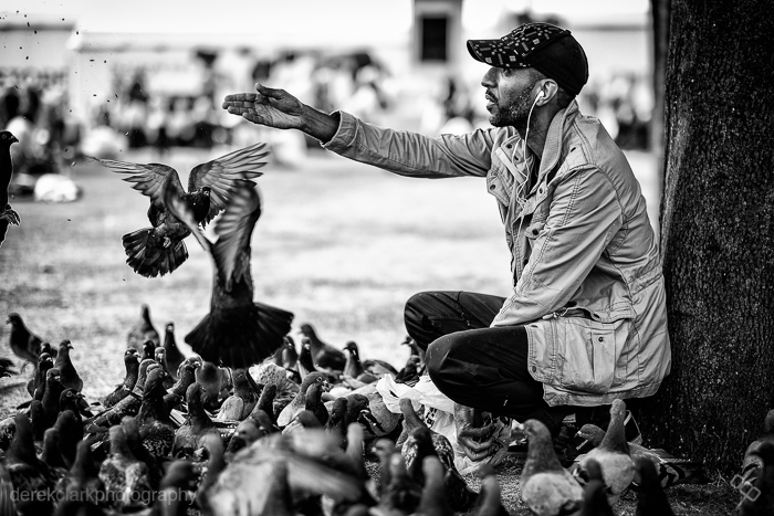
I recently uploaded a video to YouTube featuring a selection of my street photography during the 2014 Commonwealth Games in Glasgow (Scotland). It's kind of a video contact sheet in a way, as there are a few shots in there that are obviously short sequences. There is one picture in the video that seems to stand out for some people and as I remembered it was a lengthy sequence, I thought it would make a great Digital Contact Sheet. Feel free to check out the video mentioned above by clicking HERE. Click on the images below for a 1500px wide version.

I came across this guy feeding pigeons at George Square during the 2014 Commonwealth Games. I shot a few frames leading up to what you see above using the 10-24mm lens that Fuji had sent me to try out, but it was a bit wide so I switched to the 56mm f1.2. As you will see from the contact sheet, I started off at the subjects right hand side, but the background was messy and I moved from a low POV to standing. I still wasn't getting what I was looking for and I knew there was a good shoot here. I don't often spend as much time on a single scene when shooting street photography, but I felt it was worth sticking with and besides, neither the subject or the pigeons were bothered by me being there. I was using the Fuji X-T1. The X100S would typically be my weapon of choice, but I was testing lenses for Fuji too.

I moved around the scene in a clockwise direction, taking more shots than I normally would have, but the birds were changing constantly and I knew it would be a tiny move either way that could make the shot. I started off at f4, but as I moved to the subjects left side, I switched to f1.2 to blur the background and loose the distractions. Sometimes you can see all the elements of a photo and you just need to wait or keep shooting until those elements come together to make that single frame that works in all the right ways. Sometimes you wait and the scene falls apart and you get nothing.
 The image above is the straight out of camera JPEG. These last couple of years I've started to wear glasses, but I look over the top of them when looking through the viewfinder, tipping my head forward to try to get in as close as possible. This is not the best way to get level horizons, so as you can see from above and the final image below, I had to straighten the picture in post. But the point of showing the SOOC version is to let you see how nice the Fuji JPEG's are. The X-Series are the first digital cameras that I feel could have useable files without the need for computer work. If fact, adding Contrast and Clarity in Lightroom is all you might need for a great shot.
 This is the finished shot (above). 1/4000th of a second at f1.2 & ISO 200. After straightening the horizon as much as I could without chopping off part of the guys feet and hat, I sent it out the Nik's Silver Efex Pro 2 to get converted to B&W. This is my own preset for street photography, but it's mostly just a good mixture of Contrast and Structure. As long as my picture is exposed properly, it's a one click process in SEP2 and then save back in to Lightroom ready for export. As you saw from the contact sheet, there were many usable shots (maybe as many as 15), but on this occasion I felt that there was a possibility of something better. I was waiting on a gesture from the subject or something interesting from the birds. As I pressed the shutter and the image was displayed in the EVF, I knew I had got what I hoped for. In that single gesture of the hand, I knew I had what to me looked almost biblical. That was the last frame I shot of the scene with the X-T1 and the 56mm. Although I shot six more with the X100S and the TCL-X100, I knew it was pointless as I had the one I was looking for.
P.S. I have a new story published on the Kage Collective site today called Fashion Consciousness
VSCO Keys :: Pimp My Keyboard
 A recently wrote a first look review of VSCO Keys that you can find HERE if you missed it. I hadn't used VSCO Keys for long at that point, but I knew it was going to be a real time saver. But after using it for a couple of weeks, I started to notice that my original VSCO keys layout was close, but not quite where it needed to be. I was finding it wasn't as intuitive as I would have liked and as I was using it in banks across the keyboard (W up, E down. R up, T down...), I noticed that it was too easy to lose where my fingers were supposed to be as I got to the centre of the keyboard.
So I decided to pimp my Apple keyboard for a little visual help. I bought a sheet of Black (Non Transparent) Keyboard Stickers from Amazon and after adjusting the positions of my shortcut keys using the layout section of the VSCO website to a more intuitive system, I placed the stickers where I thought they would give me the best indication of where things were. The stickers are black with white lettering, which is the opposite from my white Apple keyboard. It was so successfulI that I now have a set of white stickers for my black Macbook Air keyboard.


As you can see from the photo, the first group of keys (from left to right) are black with the top two being Exposure - & + (Q & W) and then Shadows (A & S) and Blacks (Z & X) below. The next group are Contrast at the top (E & R) with Highlights (D & F) and Whites (C & V) below. So the dark stuff is (mostly) on black keys and the lights are (mostly) on white keys. Blacks and Whites also sit side by side. It's simple things like this that make me remember things easier, but whatever works for you. The next row of (black) keys are Temperature, Tint and Vibrance (from top to bottom). After that it's a mixture, but again the stickers are all placed to make it easier to remember individual keys, which can be as simple as placing a black sticker in the middle of three keys doing non related functions.


As you probably know, adding the Control, Alt, Shift, Command or Fn keys gives a completely different function to each key. I try to keep similar things mapped to keys, like Saturation is under Vibrance, sharpening is under Clarity...etc. Number keys 1-0 are left for star and colour ratings, but also apply presets when the Cmd Key is added.
So VSCO keys has dramatically speeded up my workflow and it's still on the increase. I still like to use the Logitech G13 for culling, but I find the two systems work well together. There is one thing I'd like in VSCO Keys that I cant find in the Layout software. In Survey Mode you add photos to the selection by pressing Shift and using the arrow keys. I'd love to have the < & > keys set to this function, but without the need for the Shift Key. Maybe it's in there, but I can't seem to find it. You can download a free 30 day trial of VSCO Keys HERE, so there is nothing to loose and everything to gain. You can buy keyboard stickers from Amazon, but make sure to get the Non Transparent ones or you will see double letters on each key.
VSCO Keys :: Speed Up Your Workflow
![]() There's been a buzz surrounding VSCO presets for Adobe Lightroom and Apple's Aperture for some time now. I can't say I've had much experience with them, but lots of photographers swear by them. Even my buddy Patrick La Roque is a self confessed VSCO addict. But I had a look on the VSCO website recently to see what the new Film Pack 5 included and came away with something I hadn't bargained for.
There's been a buzz surrounding VSCO presets for Adobe Lightroom and Apple's Aperture for some time now. I can't say I've had much experience with them, but lots of photographers swear by them. Even my buddy Patrick La Roque is a self confessed VSCO addict. But I had a look on the VSCO website recently to see what the new Film Pack 5 included and came away with something I hadn't bargained for.
VSCO Keys is a workflow dream and I thought you guys would be interested in something that can drastically reduce the amount of time we spend editing in Lightroom. VSCO film presets get lots of exposure on the web, but VSCO Keys, maybe not so much. So here is a quick look at what VSCO Keys can do for you.
VSCO is basically a plugin that maps your Mac or PC keyboard to the sliders in Lightroom. Once installed, all you have to do to activate VSCO Keys is hit the Esc key on your keyboard and you're good to go. The VSCO Keys icon in your Menu Bar with be grey when inactive and colour when active. There are two templates available from VSCO the 'Simple' one that changes very little on your keyboard and the 'Standard' all singing all dancing template that changes most of the shortcut keys on your keyboard. The best bit is that you can make your own template on VSCO's website and not only download it to your computer, but they also supply a PDF diagram of all your shortcut keys (like the one below). Probably the easiest way (and the way I did it) was to take one of VSCO's templates, duplicated and save it with your own custom name. Then you can tweek and change the things you dont like and keep the things you do.
It doesn't take too long to get the hang of where everything is and the difference it makes to editing time is pretty significant. Remember that you don't just have one set of keys on your keyboard, when you press Shift, Control, Alt/Option or Command, you have a different set each time.

Second Shootr v1.2
 In March 1976 Francis Ford Coppola started filming a little movie called Apocalypse Now. Filming was set for five months, but due to all sorts of problems and delays it was three years before a version was first shown, a version that wasn't quite what anyone involved in the movie expected or the promised end result. In the end, it's arguably one of the best Vietnam Movies to come out of Holywood. So what does this have to do with an iPad app?
Second shooter is an iOS app that helps photographers get and stay Organized? It has been available for the iPhone and iPod touch for a couple of years now and it's a very useful app and the best of its type I have tried on the iPhone. Second Shootr 1.1.1 was released back in June 2010 with version 2.0 being mentioned on the SS blog as far back as Feb 2011. But there has been long gaps with only the occasional blog post to reassure users that v2 was on it's way and that it would include an iPad and desktop version that could all be synced together...it sounded perfect.
An update to Second Shootr has now been released and is available on the App Store, but it's not the promised v2.0, it's v1.2. The great news is that it's now made to work on iPad as well as iPhone and iPod touch and it takes advantage of the Retina Display. The iPad version is really nice and it's very tempting to start using it exclusivly. Entering data is so smooth and intuitive that you acctually enjoy typing in new client data. Sadly there is no desktop version, but the apps makers say that SS v2.0 is still in the pipeline and will be coming in the near future. In fact their photography business Plinkk Photography has been put on hold so that more time can be spent on the big SS update.
So the big dilema for me and I expect for a lot of other uses now, as iPad & iPhone/iPod Touch versions can't be synced, is to go with one of three options.
1. Start using the iPad version, which is much easier to input data.
2. Ignore the iPad version and stick to the iPhone, as the phone is the device that goes everywhere with you.
3. Input data twice and use both devices.
Well done to the people behind Second Shootr for getting this great app finally on to the iPad, but please please give us the ability to sync between OS devices. A Desktop version would be the icing on the cake!
If you haven't tried Second Shootr yet, go to the app store download it...it could make your life easier! Well worth £4.99 (uk).
Workflow Wizard 2:: The ExpoDisc
 Back on the workflow challenge again, trying to speed things up. After watching the excellent course by Zack & Jody Gray on Creative Live last week, I was amazed at how little time they spend on post production. Start to finish, from importing the images to album design takes them just five and a half hours. Now that's fast, really fast!
So what's the secret? Zach & Jody say it's all down to getting white balance and exposure consistent and accurate in the camera using an ExpoDisc. So I thought I'd give it a go and happily handed over my cash to the nice man at Warehouse Express. So two days later and £79+p&p lighter, I received a 77mm ExpoDisc in the mail. The first thing I noticed was that it didn't have any threads to let you screw it on to a lens. It just stuck on the front of my 85mm 1.4 as if by magic (it might actually be magnets). Buy the size for your largest lens and then just hold it over the front of your Smaller ones. It even works on the tiny X100 lens.
 The ExpoDisc works by using your camera Custom White Balance function. Canon users get the short end of the stick here, as there are more steps involved in setting a custom white balance and you need to either put the camera on manual focus, or get used to using back button focus. But as I don't own a Canon DSLR, I can't go into detail about how to go about it here (please check your manual). I'll be using a Nikon D300s for this test, but you can apply it to the method your camera uses.
You need to have your camera set to Manual Mode and Custom White Balance. For most Nikon cameras, you would press and hold the WB button on the top left of the camera, then turn the thumb dial until the display reads 'Pre' (right hand side).
Now before I go any further; getting the correct exposure is not an exact science with the Expodisc, and even more so with a Nikon. To get an exposure reading and set custom WB, stand where your subject is and either point the lens back to your shooting position, or toward the light source (as you would with a light meter). Which one you choose will depend on the lighting conditions, but mostly it will be back toward your shooting position.
 Please note that the exposure reading you get from a Nikon differs by 1 stop when the camera is set to grab a custom WB (flashing 'Pre').
1a. Camera pointing back toward shooting position, and exposure set before entering into custom WB capture mode (flashing 'Pre').
1b. Camera pointing back toward shooting position, and exposure set after entering into custom WB capture mode (flashing 'Pre').
1c. Camera pointing toward light source, and exposure set before entering into custom WB capture mode (flashing 'Pre').
1d. Camera pointing toward light source, and exposure set after entering into custom WB capture mode (flashing 'Pre').
Please note that the exposure reading you get from a Nikon differs by 1 stop when the camera is set to grab a custom WB (flashing 'Pre').
1a. Camera pointing back toward shooting position, and exposure set before entering into custom WB capture mode (flashing 'Pre').
1b. Camera pointing back toward shooting position, and exposure set after entering into custom WB capture mode (flashing 'Pre').
1c. Camera pointing toward light source, and exposure set before entering into custom WB capture mode (flashing 'Pre').
1d. Camera pointing toward light source, and exposure set after entering into custom WB capture mode (flashing 'Pre').
NIKON D300s: Setting custom WB.
- 1. Place the ExpoDisc on the front of your lens with the white side facing the lens.
- 2. Hold the camera in front of your subject and point it back toward your shooting position (see above).
- 3. Adjust your ISO to suit the lighting conditions.
- 4. Set the aperture to what you want to use.
- 5. Set your shutter speed making sure it's at least one over focal length (50mm = 1/60).
- 6. Make sure your meter readout is centre (correct exposure).
- 7. Press and hold the WB button until 'Pre' flashes.
- 8. Press the shutter button to fire a shot (it won't show up on your memory card).
- 9. The camera display should be flashing 'good' to confirm success.
- 10. Remove the Expodisc and shoot. Adjust shutter speed if you need to adjust exposure.
*
The steps above look a lot, but it actually only takes a few seconds to do.
The following examples of different light types are shot as follows. Left image. Aperture Priority and Auto WB. Centre image. Manual mode with exp/WB taken toward shooting position. Right image. Manual mode with exp/WB taken toward light source.
 DAYLIGHT (from window on a cloudy day)
'
DAYLIGHT (from window on a cloudy day)
'
 INCANDESCENT
'
INCANDESCENT
'
 FLUORESCENT
'
FLUORESCENT
'
 The shot on the left is auto WB and the shot on the right is using the ExpoDisc (cloudy windo light).
***
The shot on the left is auto WB and the shot on the right is using the ExpoDisc (cloudy windo light).
***
I'm pleased with the ExpoDisc and I'm looking forward to trying it out on a proper job with different lighting conditions. If it can save a lot of time in post it will be worth the money. If your exposure and white balance are consistent and correct, a preset in Lightroom or Aperture could be applied at import to add a bit of contrast. That should de-flatten RAW images and give you files that are spot on.
ADDENDUM-----------------------------------------------------------------------------------------------------------------------------------------------
My friend Patrick LaRoque asked in the comments, if there was much difference between the ExpoDisc and a regular grey card? So I tested a few options and to be honest there isn't a lot of difference. I think the ExpoDisc is a little more user friendly when it comes to shooting on the go. Even the Colour Checker Passport has a small grey card which is handy, but doesn't fill the frame. Being able to use the ExpoDisc to set exposure is a bonus to. Have a look at the results below or click here for a larger version.

Lightroom & Photoshop Workflow Wizard
 My ears prick up the minute I hear the word workflow. It's the one area of photography that can be a bit of a drag. The digital age has brought many great things, like being able to take lots of photos for free. The digital age has also brought us a few bad things though, like being able to take lots of photos for free (yeh you read that right). If you shoot weddings, you're taking photos for hours and they stack up fast. My editing sessions always start enthusiastically and then take a dive after the first three or four hours, so I'm always looking for ways to speed up my workflow and always curious about how other photographers work in post.
The Logitech G13 arrived at my door last Friday and I spent most of the day configuring it. It's set-up is very similar to a Wacom tablet and it doesn't take long to get the hang of it. It's easy to set-up Photoshop and assign keys on the G13 to just about anything. Lightroom is a different story though, as it doesn't have keyboard short cuts assigned to the sliders. The answer to our dreams comes in the form of a fantastic plugin called Paddy which is available to download HERE for free. Paddy is a little time consuming to set-up, but is well worth it. It's best to use the computer F keys as they don't have any shortcuts assigned to them in Lightroom. You can map the F keys to any of the G13's 21 keys using the Logitech software. The keyboard can then be configured in Paddy to control the Lightroom Sliders.
Paddy handles Lightroom sliders by assigning keys to move sliders by a fixed amount. I set my keys up so that for example the F4 key is assigned to Exposure +5. Every time I hit the key on the G13 that's assigned to F4, it increases the exposure by 5. F3+Shift is set to increments of 1 and F3+Alt is set to increments of 10. This might sound a bit complicated, but once you get the hang of it, it's very easy.
I have only edited using the G13 for a couple of hours, but I can see a big jump in the speed of my workflow. The keys are marked G1 to G22 so you need to memorize which key does what, but the shape of the keyboard really helps your brain to take it in a lot faster. I find I'm already reaching for keys on the G13 rather than the computer keyboard. The G13 also detects when you switch programs and applies your presets automatically, again like the Wacom tablets. You can even have three pages of presets for each software program and have each page set to a different colour (screen and keys are lit) so you always know where you are. I use a page for the Library module (blue) and a page for the Develop module (orange) in Lightroom. The G13 is available from Amazon in the UK for £62 or in the US for $62.