Apple

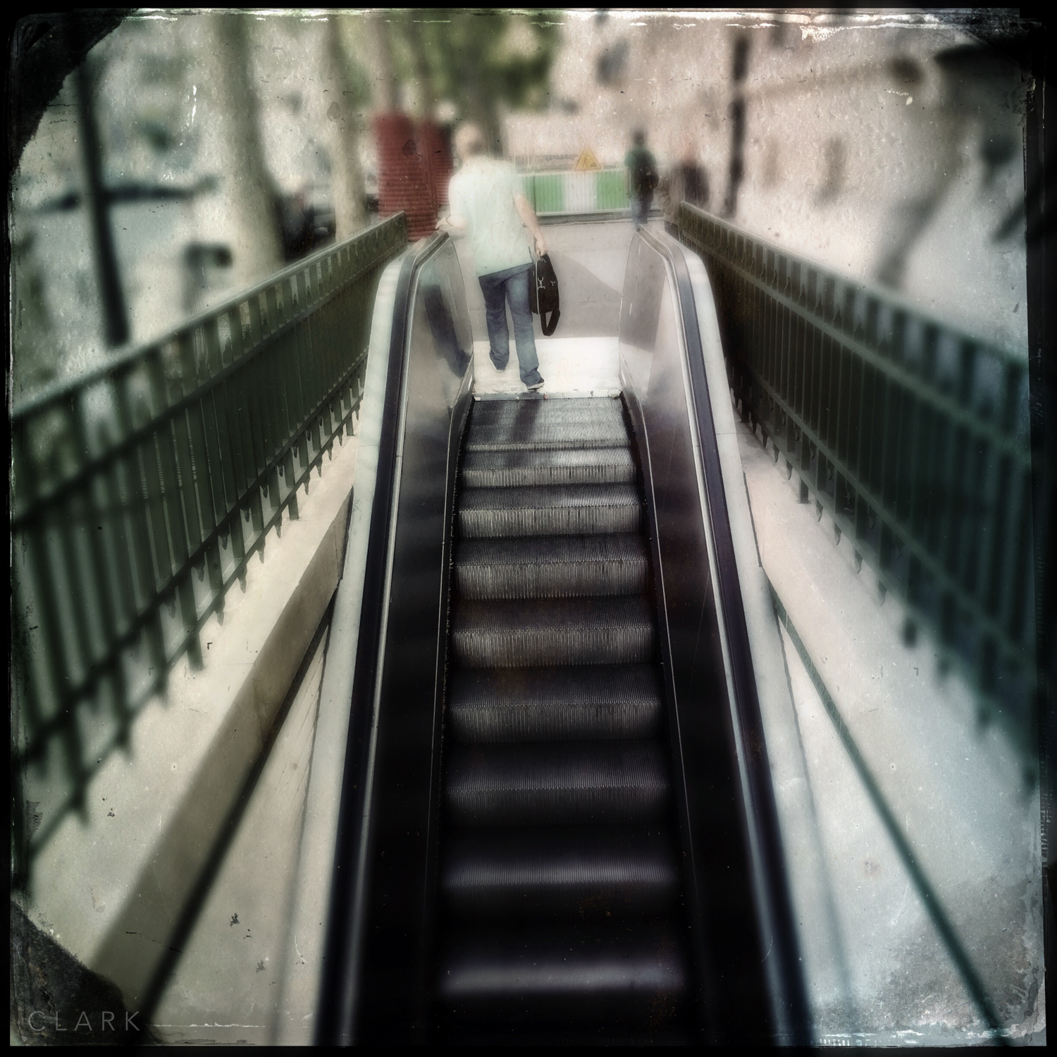
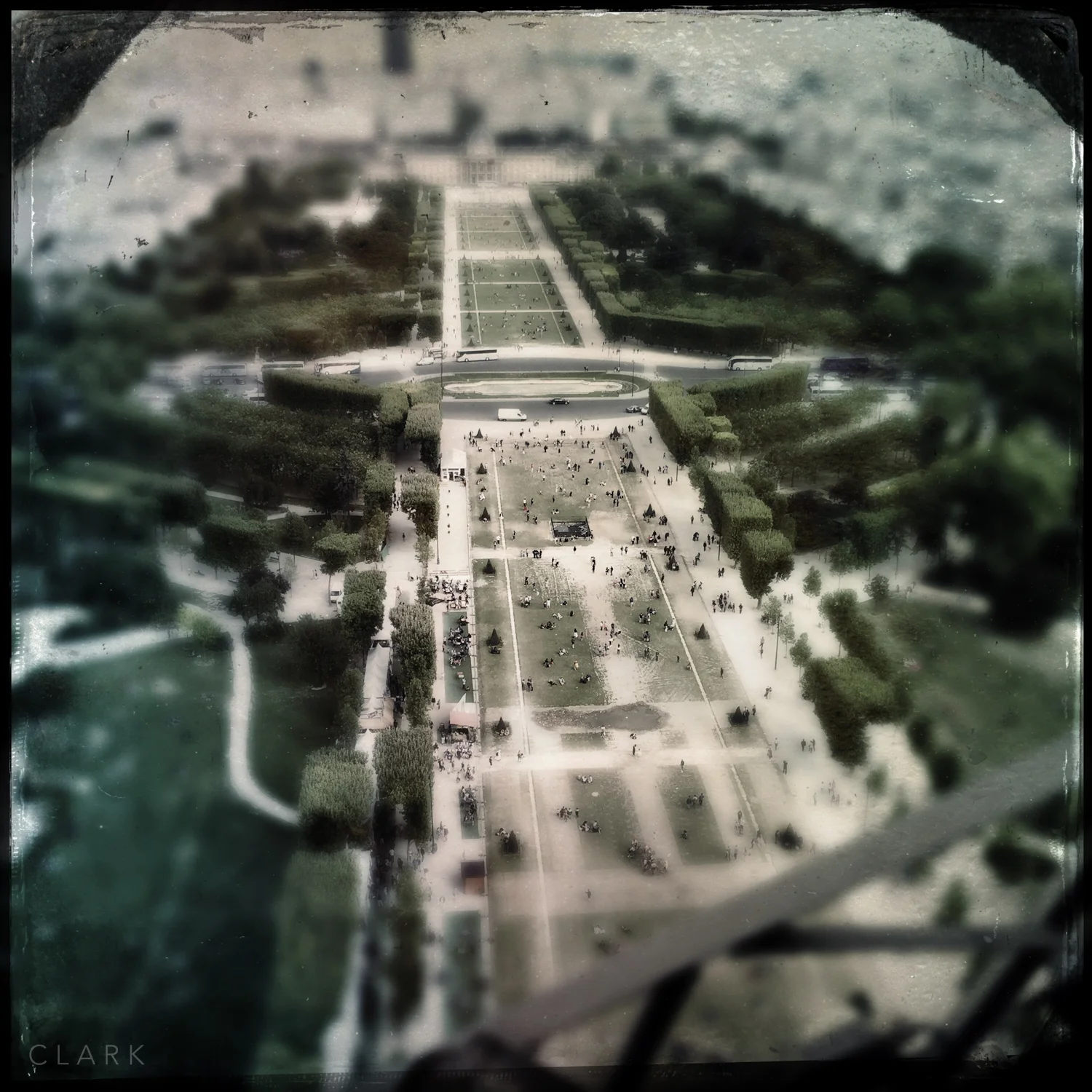
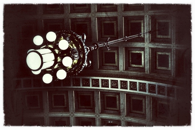
Paris By iPhone and Hipstamatic

I wanted to shoot a lot of iPhone pictures on a trip to Paris earlier this year as a way of doing something different from what I normally would have. I had my Fuji's there too and I shot loads with them too, but to make sure I followed through with the iPhone plan, I set myself the goal of making a Blurb book as soon as I got back from the trip. We arrived back on the Friday and by the Saturday night, the book was put together and ordered.

Paris is a beautiful place with fantastic people and they don't deserve to be killed and maimed in the name of any god. I love to travel and if I want to complete a major project I'm working on right now, I will need to visit a number of countries. The world is a very dangerous place for everybody right now and as usual there is oil and religion involved. At least we have proof that oil exists!

Asia 2013 part 3 :: My Favourite (Travel) Things

DerekClarkPhotography.com-3xXCams Fuji X System Cameras (iPhone photo)

This one is really obvious, But I stands out the most when traveling just how fantastic it is to be shooting the Fuji X system. There’s no way I could have brought three cameras and the equivalent to a 35mm, 50mm, and a 27-84mm. The 35mm being fixed to the X100, but if I was shooting a DSLR system, it would be a 35mm f1.4, which is not a small lens. It’s amazing to see all these moms and dads running around with big DSLR’s because they think that’s how you get great photos.

DerekClarkPhotography.com-DSCF3259

Fujinon 18-55mm f2.8-f4

This was a last minute thing before I left. I’m a prime lens shooter, but I went for the 18-55mm for three reasons. 1). The longest Fuji lens I had was the 35mm. 2). I have the 18mm f2, but I get mixed results with it, I can’t put my finger on it, but sometimes it looks fantastic and other times  3). A zoom is just so much more versatile as a travel lens. The variable aperture bugs me and I’m not used to lenses that extend, but it’s definitely been the go to lens on this trip (so far). I was using it on the X-E1 and body and lens work well together, but it is a bit front heavy. It feels much better on the X-Pro1. But if you own an X-E1, don’t let it put you off.

DerekClarkPhotography.com-DSCF3266

Apple Macbook Air 11”

I bought the 11” Macbook Air for this trip and I’m so glad I did. I originally intended bringing a Windows laptop, then had the bright idea of buying a smaller Netbook as it would fit in the ThinkTank Retrospective 7 and I wouldn’t need to bring a bigger bag. That idea got out of hand and I ended-up buying the 11” Air. I have it set-up exactly like my iMac, so it’s so easy to edit and organize. The 11” Air was a good choice and I’m glad I bought it. I bought the 128gb version with 4gm of RAM for £600 second hand. It was the current model until Apple announced the latest updates a couple of weeks ago) and in mint condition. The downside of the 11” version is the omission of the SD card reader and the 3rd USB port.

DerekClarkPhotography.com-G3

Kingston MobileLite G3 SD Card Reader

So I bought this little card reader on Amazon for very little money and I just love it. It’s simple and does what it says on the tin. It does feel a bit wobbly when the covers are extended at each side (one to cover the USB plug and one to cover the card(s) if you choose to keep them in), but it’s solid when the covers are pulled back and in use. The G3 has slots for both SD and Micro SD cards and takes up very little room in even the smallest camera bag.

DerekClarkPhotography.com-DSCF3270

Think Tank Retrospective 7

The Retrospective 7 is great for travel or as an everyday camera bag. I have a few dislikes about it (as I do with any bag). The side pockets are too tight for my liking and I’ve ended up using them for the included raincover in one side, which I’ve used and really glad it’s there, and wetwipes and travel cards in the other. I’d liked to have a bit of elastic on one side at least to accommodate a water bottle. On the up-side for travel, being so tight makes it harder for thieves to get at. My second gripe is that the inner compartment should have a few pockets with Velcro lids to keep small items like batteries, card readers, lens cloths, headphones etc... But apart from that it’s a great travel bag that doesn’t look like a camera bag. If you haven’t seen my post on packing for this Asia trip, take a look HERE to see the contents of my Retrospective 7, it holds a lot of gear.

Oh, and one final thing...

Micro Fibre T-Shirts

I bought three of these t-shirts in a sale for £5 each. They’re lightweight and absolutely crease free. At the end of a day, I simply wash one in the shower and it’s dry in the morning and looks like new. These shirts are an essential item of clothing for traveling light.

Fujifilm X-Pro1 & iPad :: A Night At The Museum

Four shots taken inside Kelvingrove Art Gallery & Museum in Glasgow (Scotland) with the X-Pro1, edited and uploaded to the web using an iPad. I used Nik Software's Snapseed to tweak the photos and Apple's connection kit to get the photos from the camera to the iPad. This is what I'll be using when I go to Italy in a couple of months. I'll also be using FilterStorm quite a bit. Anybody tried Photoshop Touch for the iPad? 20120328-072749.jpg

20120328-073147.jpg

20120328-073259.jpg

iBooks Author

I don't remember ever getting butterflies in my stomach when using a piece of software for the first time, but that's exactly what happened with the new iBooks Author app. Apple have just changed the face of modern culture again with a bold move into the book publishing world, and a lot of publishers are about to go out of business....a lot! But just as the music world giants like Sony were scratching their heads a few years ago and not coming up with a solution for the dire state of the music industry, Apple have came in with a move that is to the publishing industry what iTunes was to the music industry. I hate to see business's going to the wall, but as Bob Dylan said "times, they are a changing".

Here's another quote, this time from Dane Sanders "we now live in a digiflat world". That means we are all on an equal playing field. I'm typing this blog post on my iPad in a play area while my kids are getting tired out (hopefully). I'll then upload it to my blog for free and you get to read it for free. We can publish what we like and we can look for and read what we like (at least until the men in suits ruin the internet).

iBooks Author is awesome! I've played with it over the weekend and it's really easy to get to grips with. There's a small learning curve, but it's mostly plain sailing, especially if you have used desktop publishing software. I put together a mockup of a documentary book as a way to get to grips with the app. The 'Sections' through me a bit at first. Sections are great for textbooks, but I just wanted chapters in my book, one per project. But once I found how to delete a section, I was off again. Another thing I'm trying to do is link text box's that I make and auto flow the text over a chapter, but I still haven't managed to figure that one out at the time of writing this post (leave the answer in the comments if you know). That said, it wasn't long before I had a couple of chapters laid out the way I wanted, complete with photos that popped up full size at the tap of a finger and embedded galleries that work by swiping the box on the page or tapping first and then swiping them full screen. One of the genius things about this app is that when you click on the preview button it sends the book to your iPad (as long as it's connected to your Mac using the dock cable). The book then stays on your iPad, which let's your friends and family preview your latest masterpiece before you publish it to iBooks. I should state that the app is for Mac only, but maybe a windows version is in the pipeline? I would be gutted right now if I was still a windows user!

When you want to publish your book you simply upload it to the iBooks Store and fill out the information required (which I believe includes tax forms). The financial deal is a 70/30 split, with the author getting the bigger half. If anybody reading this has published a paper book, you'll know just how great a deal Apple is offering.

The best way to great your head around this game changing piece of software is by playing around with it. Even if you only intend buying books in the new format, iBooks Author will give you the best insight into how these books work on the iPad. I can't wait to see some of the new and innovative books that come out on this format.

FilterStorm:: The Best App For Photographers?

20110704-094044.jpg There's a lot of great photography apps out there, but most of them are geared toward one or two features. Some lean toward shooting and uploading straight toTwitter, Facebook etc, some do tilt/shift and some only do black & white. Thanks to Apples camera connection kit, I can now take the SD card from my Fujifilm X100 and import the photos straight onto the iPad 2. I needed an app that could then resize the files to my blog sizes. I tried PhotoResizer, which did the job, but was a little sluggish and again a one trick pony.

FilterStorm is what the Photoshop app should have been like. It does a huge amount of different things and it does them really well. Apart from Settings, Load Photo Star Rating and Automations, The app is split into 4 sections, which are in the form of tabs - Export, Metadata, Filters and Canvas. Export does what you would expect, like saving back to your photos folder of sending by email, Flickr, FTP or Dropbox. You can also choose size and quality options here too. The Metadata tab is set for viewing meta and renaming photos by default, but click on Settings and you get whopping great 31 switches that let you turn on features like Keywords, Captions, Subject, Category, Location, Copyright, Usage, Contact Details...etc. The meta section really is a wolf in sheep's clothing. Canvas is where you can crop, scale, rotate, flip,straighten, Scale and add borders. This is another huge section. Filters is the place where we pixel pushers all like to be. It has Brightnes/Contrast, Curves, Hue/Saturation, White Balance, Sharpening, Blur, Black & White, Clone, Tone Mapping, Text, Noice Reduction, Noise, Redeye Brush, Colour, Vignette, Posterize and Add Exposure. The great thing is that it does them all really well.

This is the best i photo editing app that I have ever used, and I've tried plenty. The thing is, I've just checked on the Apple App Store so I could wright the price (2.39 UK) and saw that there is a pro version (8.99 UK) with even more features. My one gripe would be that if you have already bought the standard version, you shouldn't have to pay the full price for the pro version. That goes for apps that are different on the iPhone & iPad, if you buy it on your iPhone and the iPad is a more expensive & more powerful app, then you should only have to pay the difference and not the full cost. But all that aside, Filterstorm is the best app for photographers I have came across to date. It was made with photojournalists in mind (although photojournalists shouldn't need a clone tool). I'm going to buy the Pro version now, as there are a few features that I quite fancy (batch editing being but one). Filtersorm (iPod, iPhone & iPad) & Filterstorm Pro (iPad only) are available on the App Store. The photo above is from the Pro version.