The Digital Contact Sheet :: Episode 3

DigitalNegative680-E3 It's only episode 3, but it's time to change the format of this feature. When I first thought about doing The Digital Contact Sheet, I imagined it with...well you know, contact sheets. But rather than sit on the idea for a while and get it right in my head and then transfer it into a blog post, I went ahead and jumped in before I really thought it through. That's not always a bad thing as ideas come thick and fast and most of them never see the light of day. So I kind of went with the "ship anyway" mentality, but now I'm changing it into what it should be, with proper contact sheets and all. I hope this is a welcome change.

DerekClarkPhotography.com-003

This sequence of images were shot in Italy last year at The Moonlight Marathon near Venice. The Contact sheet, above, shows the photos straight out of camera, which in this case was the Fujifilm X100. This ended up being called Running Into Darkness and was my first story on the Kage Collective website.

DerekClarkPhotography.com-

I usually know while I'm shooting a project if it will be in black & white, Colour or a mixture of both. This shoot was always going to be black and white, so I've converted the contact sheet in Photoshop and used +70 of Contrast and +10 of Brightness. This also helps to show the markings in red. As this is The Digital Contact Sheet my markings were done with a Wacom tablet, rather than a wax pencil.

DerekClarkPhotography.com--2

The red boxes are the frames I would use and the ones with the red X's are the rejects. The others are OK, but more than I need. The three with the stars are the ones that tell the story. It's interesting to see a sequence of images in contact sheet form. One of the things that stands out right away, is whither I have worked the scene enough. I know by looking at this sheet, that I would have liked to have moved around a bit more and got some different points of view. Remember to click on the contact sheet above to see a larger version.

DerekClarkPhotography.com-DSCF9782I was shooting with the X100 which has a full frame equivalent of a 35mm lens, so I'm pretty close here. It's a tense situation and I don't want to come accross as too mercenary, so the shots of the guy on the ground are all shot from the hip. I would have framed it differently if the camera had been up to my eye, but I think this wonky composition adds a bit of tension to the shot and works well.

DerekClarkPhotography.com-DSCF9782-Edit

I chose the frame above as my favorite, because it asks more questions than it answers. Is he alive? Is he dead? What happened to him? Is that blood on the ground or water? Is the man standing over him a stranger or a friend? is he performing CPR? The number on his shirt is turned up and not that noticeable at first. The guy standing over him is obscuring his running shoes (which would tell all). As part of the story, you already know what's going on here, but I think this frame stands up well on it's own and in some ways more powerful when taken out of context. I converted these three shots to black and white using Nik Software Silver Efex Pro 2. I used my homemade preset for street photography.

DerekClarkPhotography.com--2-2

This is not the sharpest photo ever made, but the content is more important than the technical and this shot is really important from a storytelling point of view. It also reveals the running shoes which gives enough information to know what's going on.

DerekClarkPhotography.com--3

This is the last shot of this sequence, although not the end of the story. I continued to shoot the runners until the last one had gone. I then turned my lens on the aftermath of hundreds of plastic bottles.

I believe a photographer can learn as much by going through a contact sheet as he can from actually shooting the photos. It's good to ask yourself questions. Did I get everything I could have? Did I work the scene and get all the angles? Did I get enough tight, medium and wide shots?

As always, I hope you've got something out of this post and maybe some of you will try printing a contact sheet and studying your photos more. The contact sheets in this post were made in the Lightroom 4 print module. I used Print To File to save the sheet as a jpeg.

Brand New Website

DCPblack&white920x250 It's been a long time coming, but the new website is now live (you're looking at it right now). If you came to this post from a link elsewhere, click HERE to go to the home page and have a poke around.

I've been trying to figure out for some time how to handle my different sites. Do I have everything separate or all together on one site. In the end, I've decided to make the home page of this site a portal for all of my photography types, so that I can have one business card with one web address that will act as a hub for all my photography interests. There are six boxes on the home page that take you to different areas. The three on the top are internal and the three on the bottom are external links that take you to separate sites.

I'm always open to feedback, so let me know what you think of the new site, or if you find any links that are broken. At the time of writing this post, the sliders on the Wedding & Portrait pages don't slide automatically, but I'm on it right now and hope to have them working soon.

The Digital Contact Sheet :: Episode 2

I thought it would be a good idea to use Episode 2 to look at white seamless portraits. I met Ryan at my brothers 50th birthday party, where he was booked to provide the nights entertainment with his one man magic show. He's a very talented and highly entertaining performer and it's definitely worth seeking out one of his shows! I was shooting candids with the X100 and Ryan had asked if I would email him some of the photos. When I did email some photos to Ryan, I planted the seed for a portrait shoot and a couple of weeks later we got together to do this shoot. I used the Lastolite 6' x 7' HiLite background with the optional vinyl train. I shot with both umbrella and softbox that day. I use a large piece of plexiglass on the floor to give me a nice reflection under the subject, which looks great on both black or white white set-ups. I'll put some links at the end of the post to examples.

Above : This is one of the many frames that I used from this shoot, it's definitely not the best, but I wanted to choose something with a lot of negative space so that you could see how a shot can look so big, but actually be done in a small space. I really like negative space and I hate it when I hear a lot of photographers on the web giving advice like 'fill the frame'.

Above (left) : I decided to use a chair half way through the shoot, so that we could change it up a little. I started with the chair turned backwards and Ryan leaning on the back. I was pretty sure I wasn't going to use these shots, but I just needed to start somewhere and let it evolve.

Above (right) : We then re-introduced the cards (I had already shot some with a black background). Ryan started messing around with the deck, but it looked a bit stiff, due to the straight-on position of the chair. It's very easy to loose contrast with the HiLite as the lights inside the background are blowing it to pure white and coming straight into the lens.

The Lastolite HiLite : For those of you that are not familiar with the HiLite series of backgrounds - They basically come in a circular bag and pop out  to their full size (in this case 6' x 7') just like a reflector. Then, with the HiLite lying flat on the floor, you lift each corner of the front section and place one of the rods to hold the front and rear apart. Stand the HiLite up and insert one or two lights inside and close the zips.

There's a two stop rule to white seamless, where the background should be two stops brighter than the main light. I would say a stop and a half works better with the highlight, to avoid loosing contrast. I always use a light meter when shooting with the HiLite these days and would definitely recommend you do to. I like to shoot at f8 with the HiLite. I aim to get my main light at f8 and the background light at f11.5. I then add a fill light to whatever looks good (if needed). I have also used another two lights recently, on the floor, outside of the vinyl train and blowing the floor behind the subject to white.

Below (top) : I moved the chair to an angle it made for a much more interesting photo. Ryan just ran through a series of shuffles and tricks. This was before I had the 60" umbrella, so I'm using two smaller ones as a main and a fill.

Above (bottom) : I move in closer so that I'm not throwing away pixels and I'm also getting Ryan at a higher resolution. At this point I started to realize that being a magician is similar to being a writer or a musician. You spend a lot of time on your own, practicing and perfecting your craft and it's even more lonely than editing photographs on a computer. This thought obviously came from Ryan's isolated look. I knew at that point that I wanted to put him in a big white room, isolated to one corner.

Below : This is the shot I wanted to use. I  checked that the background was blowing to pure white and used a mixture of the Gradient Tool and Brush tool in Lightroom to get rid of all the things outside of the background. I then converted it to black and white. Ryan is a bit too central in this shot, but sometime you don't have the option when using such a small background.

I then moved over to Photoshop and as I knew everything was pure white, I selected the crop tool and set my background swatch to white. I then dragged the crop tool out to the full size of the photo and grabbed any of the four corners to pull the photo out to the desired amount of negative space (hold down shift to keep the aspect ratio the same), then hit enter and everything is filled with white. The result is the photo at the top of the post.

It's great to look back at photos that you shot in the past and see that you're getting better all the time. If I was shooting this now, I would work on my lights more to prevent losing so much contrast. Click here for an example of a recent shoot with great contrast.

You can see more of the Ryan Davidson shoot by clicking on these links White Background or Black Background

For more information on shooting and editing white seamless I would suggest reading Zack Arias's feature on his blog starting of course with Part 1. Better still, buy his Studio Lighting course on Creative Live. It's well worth the money and probably THE best thing to come from Creative live!

That's it for this episode of The Digital Contact Sheet. Leave me a comment if you get anything out of this or if you have any suggestions on how the feature could be better. I would also appreciate it if you could spread the word to anyone who you think would find this feature useful.

Moo Business Cards

My latest business cards arrived from Moo the other day, and this time round I thought I'd try their glossy finish. As soon as I opened the box, I was impressed with the quality of the new cards. The card stock is nice and thick and they certainly live up to their glossy title! The black box's that the regular size cards come in are very classy and look great sitting on a desk!

As these cards are my own design and include a brand new logo as part of a re-branding, I ordered a small amount of cards to make sure everything is where it should be (I've learned the hard way in the past). I'll be ordering more now that I've checked these ones.

As you can see from above, I have both the regular size business cards and the Moo Mini's. I keep the Moo Mini's on one of their keyring holders so I always have them with me. The regular size cards are mostly in my camera bags and in my car.

I've always found the quality from Moo to be very good, but it looks like they've upped their game even more with this latest batch.

The Digital Contact Sheet :: Episode 1

Welcome to episode 1 of The Digital Contact Sheet. I explained yesterday what the aim of this series was, but if you missed it, click here. I posted this photo (below) on my street photography blog 35mmStreet last summer and I thought it would be a good example to get started. All these shots were taken with the Fujifilm X-Pro1 and a 35mm f1.4, 125th sec, f3.6. ISO was set to auto and moved between 400 and 640. I don't recommend using Auto ISO with the X-Pro1 or X-E1 at the moment, due to the lack of a minimum shutter speed in Aperture Priority and the lack of Exposure Compensation in Manual Mode. But on this overcast day, the lighting was flat and Auto ISO done a good job.

    • Image 1 (below, top left) I spotted this Chinese man from quite a distance away. I was hoping this wasn't going to be the only shot I'd get, but it's important to fire one off as soon as you can, just in case! But if this had been the only frame I'd got, it might still have been usable in black and white.
  • Image 2 (below, top right) The woman walks into my frame and the man's eyes are half shut. This one is a reject and will never be used, but I'm now in position. My focus point was already set to the left of my frame as I am walking on the left side of the street beside the kerb (road side), so everyone is passing or coming toward me on the left.
  • Image 3 (above, bottom left) I took this shot and thought it was the one I was after, but as he hadn't even noticed me (thanks to the black X-Pro1 and my invisibility cloak :o), I kept the camera to my eye and went for another.
  • Image 4 (above, bottom right) Click, and number 4 is even better, but I'll go for another.

Image 5 (above) The 35mm f1.4 has a lag when focusing (18mm f2 is much faster), but in this case the delay between me pressing the shutter and the camera grabbing the shot, actually helped and got me something very unexpected. I knew I had got the best shot as soon as I heard the click, but when the LCD popped into the viewfinder for the preview, I knew I was done and walked on. Five frames taken and the subject still hadn't even noticed me.

Post Processing (top of this post) All shots from this days shoot were imported into Lightroom 4 and I applied my Fuji preset to all of them, which sets Contrast to +25 and Clarity to +15. That's always my starting point with the X cameras.  I hit P for pick on shot 4 & 5 and then sent them over to Silver Efex Pro 2. As with all my street photography shots, it's one click and I'm done! I have made three versions of my own preset, one under-exposed by a stop, one over-exposed by a stop and one in the middle. I can see by the previews in the left side of Silver Efex Pro 2 which one is right for the photo and I click it and hit save to send it back into Lightroom. Job done! I only wish all my post processing was as quick as my street photography shots.

So thats it for episode one! I hope it's been of interest to at least a few of you? I'd really appreciate a bit of feedback on this series so I can tell if I'm on the right track. If you have the time, please leave a comment down below with your thoughts on The Digital Contact Sheet?

My Bag Is Featured On Japan Camera Hunter

My Street and Documentary camera bag is featured on Japan Camera Hunter's 'In Your Bag' feature. I'm number 390 in this long running feature. You'll find a list of what's inside my bag, plus a bit of information too. Click here to see my bag Japan Camera hunter, AKA Bellamy Hunt is the man to contact if you're looking for quality cameras and equipment. Bellamy sources great gear from in Japan (where he's based) and ships it all over the world. Looking for a Leica M2? Bellamy's your man.

The Digital Contact Sheet :: A New Series

EPISODE 1 COMING TOMORROW

The idea behind The Digital Contact Sheet is to show a sequence of photos and explain why one was chosen over another or why one works and another doesn't. It could be a street shot, a portrait, documentary, wedding, landscape, basically anything under the sun. The point is to show what comes before or after the money shot! I'll also show the difference between shots that are straight out of camera and ones that are edited in Lightroom, Photoshop or Silver Efex Pro. It's a warts and all type of thing and I hope it will help or inspire anyone out there that doubts their abilities as a photographer or think that their photos aren't good enough. Maybe you need to take more, maybe you need to slow down and wait for the right shot and therefore take less photos? Hopefully there will be something in this series that will help another photographer in some way.

I'm not sure how this feature is going to work out! I might run it a few times, or maybe it will be an ongoing thing, I really don't know.... it's up to you. I'll post the first Digital Contact Sheet tomorrow. I just hope I'll have the words to describe what I need to, and make this a worthwhile feature for the readers of this blog. But I'll give it a try and hopefully some of you will get something out of it???

A Mute Reminder :: New Story On The Kage Collective

I have a new story on The Kage Collective website today. I say new, but it was actually shot back in November at the remembrance day parade in Glasgow, Scotland. As you can imagine, it was an emotional day for everyone involved, but especially for those who had lost friends and family in any of the conflicts around the world.

Please take a few minutes to have a look at A Mute Reminder and if you feel like leaving a comment on the Kage site, I'd love to hear your thoughts on the story. A Mute Reminder was shot with the Fujifilm X-Pro1 & X-E1.

The S Factor :: Fujifilm X100s

New from Fuji is the X100s, an update to the original X model. Fujifilm has done the opposite of what a lot of camera manufactures do by just giving the camera an S rather than naming it the X200. How many times do we see new models coming out with very minimal improvements? With the X100s, it looks like there has been a huge leap in the technology inside the camera, but very little on the outside. I'm really glad it's that way round as the the camera looks stunning!

Here are some of the new features:

  • 16.3 million pixels APS-C X-Trans CMOS II sensor
  • EXR Processor II
  • Hybrid Viewfinder (OVF / EVF)
  • FUJINON 23mm F2 lens
  • Intelligent Hybrid AF (with the world’s fastest AF speed of 0.08 secs
  • Start-up time of 0.5 secs
  • Shutter time lag of 0.01 secs
  • Shooting interval of 0.5 secs
  • High-contrast and wide viewing-angle 2.8-inch Premium Clear LCD (460K dots)
  • Super Intelligent Flash
  • Burst shooting rate of up to 6 frames per second at full resolution (max. 29 frames)
  • Focus Peak Highlight function
  • Digital Split Image display
  • Artistic filters
  • Full HD movie recording (60fps / 30fps)


It's nice to see the old split screen focussing making a comeback. I have a similar thing in my Olympus OM2-n, but with a horizontal line, rather than vertical. The X100s looks like a cross between that and a rangefinder patch in the centre of the screen. I'm looking forward to trying it out. The X100s will also have the fastest focusing in it's class.

Let's hope we get an update to the X100 firmware to get an updated menu and to add a Q button function to the Raw button. While I'm on the subject of firmware, we really need a minimum shutter speed added to the Auto ISO in the X-Pro1 and X-E1. This should be a Fuji priority!

Aperture Blade Runner

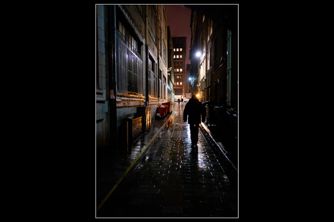
This is a cross post with my street photography blog at 35mmStreet where you can see the black and white version of the above photo. Click HERE to see both colour & B&W together and let me know in the comments what you think looks best?

I was out today, having coffee and talking shop with a couple of photographer friends John McPake and John Summers. After a few cups of tea and coffee and covering all things from sensors to lenses, books to editing, Santa Claus to Filipino Xmas parties and everything in between, we decided that we should be shooting pictures instead of talking about them. We made plans to go out for a days photography to a derelict building that's been on our photographic horizons for a while. But we made the arrangement that we would go out and shoot as long as the weather was ok, but if it was raining we would probably just get together indoors and talk or play around with radio triggers or light modifiers.

When I left the two John’s, I headed into town to have a look at the photography books in Waterstones. It was raining pretty hard and it was dark, but I pulled the Fuji X-E1 out of my bag and kept it up high, under my umbrella. I shot a few photos on the way to the bookstore and then a few afterwards on the way back to the car (with a really nice Time Life book having been purchased :o). But the main point of this blog post is just to point out that we shouldn't just go out in ideal conditions, or even fair weather. Sometimes it's the things you think you should avoid that give you something a little bit different or a little bit special. So although the golden hour is desirable, don't avoid the rain or the midday sun. Instead, we need to embrace them and use the qualities they have. The rain provides fantastic reflections and the midday sun gives us harsh contrasts shadows that can be amazing in black and white!