 I know I'm a week late with this, but I've had a lot going on recently and I wanted to give the previous post a bit of time at the top. I've selected a sequence of 25 shots that mostly aren't that amazing, but it shows that not every frame needs to be a great shot. But as I've said before, it can be more important to tell the story, and that can often mean choosing a lesser photo that's part of the overall story. Remember that some of these shots will reveal larger versions when clicked on.
 The digital contact sheet above, shows the photos straight out of camera (OOC). I have all my X Series cameras set to +1 Sharpness and the files are actually usable OOC. Add a bit of Contrast and a small amount of Clarity in Lightroom and the files really pop. Check out my buddy Patrick La Roque,'s test photos from the X100s HERE for some amazing examples of OOC files from Fuji's latest X-Trans sensor. Make sure you read his X100s review HERE
 This is my favorite frame, but straight OOC it's as flat as a witches tit and a bit overexposed. The composition is a little bit too centred for my liking, but it'll be too tight if I crop it at the same aspect ratio. I don't want it looking like a 10x8, so I'll have to live with it. I love that I shot this so close with the 35mm f1.4 and the guy had no idea I was even there!
 This is the edited colour version and to get to this point I did the following. I added my home grown Lightroom Preset '1:02. 20 Contrast & 15 Clarity' which does what it says on the tin. If you shoot with an X-Trans sensor Fuji and use LR4, it's a good idea to have a couple of presets that add about +20 contrast and a few variables of Clarity (+5, +10, +15 works well). I tend to apply these after import, but not on import, or you're stuck with them. I then added a Graduated Filter from the left with -1.82 Exposure to darken the uniform. I added a -30 Vignette (preset) and then boosted the Contrast up to +36 to make it pop a little more.
 It still wasn't reaching it's full potential, the main reason being that the colour wasn't doing anything to enhance it. So if the colour doesn't do it justice, it has to go. I made a virtual copy and applied my own Contrasty B&W preset and reduced the Highlight Slider a bit. The preset had re-set the Vignette slider to zero, but had darkened the shadows via the Tone Curve. I then applied a -20 Vignette to bring the edges that little bit darker. So this is the finished edit and was included in my essay 'A Mute Reminder' on The Kage Collective website.
 And finally, here are the other four picks from the contact sheet. The two colour shots at the top only have contrast and clarity added. They were actually usable straight out of camera. The shot at the bottom right was converted using my Contrasty B&W preset in LR4 and the one on the left was converted to B&W using my own custom preset for street photography in Nik's Silver Efex Pro 2.
So that's it for Episode 5. I hope this has been interesting and shown that a photo straight out of camera might only be half way there. Remember that everything I've done to these photos is the equivalent to what would be done in a darkroom. There's no Photoshop trickery involved, just film-like editing.
If you found this post useful, you might like Shooting Street Photography With The Fujifilm X100. My settings and method for shooting street.





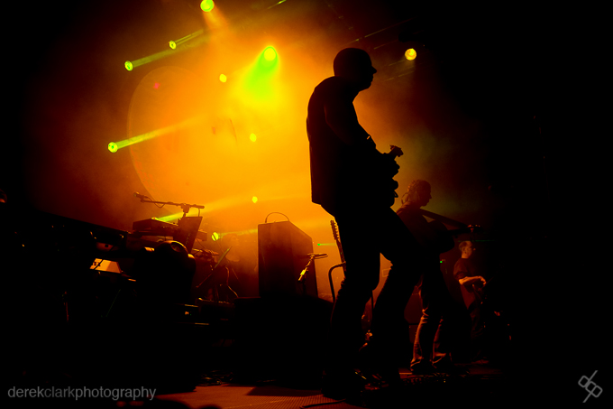

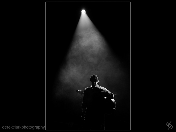
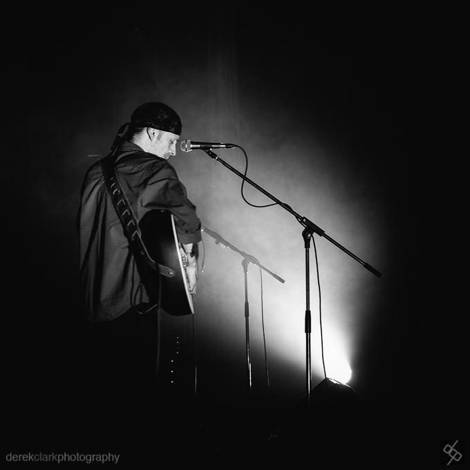
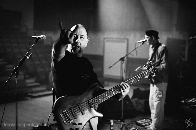


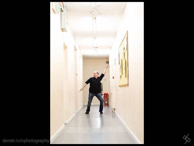 Here's some shots from last night. Back on the road tomorrow, so maybe more to come on Sunday or Monday. All these shots were taken with the X-Pro1, 35mm f1.4 at 1600 ISO.
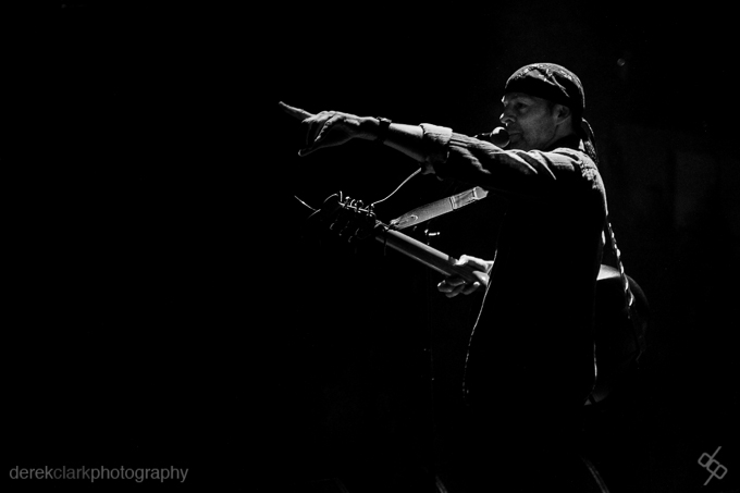 It was good to leave the studio rehearsals behind and get back on the road to play to an audience again.

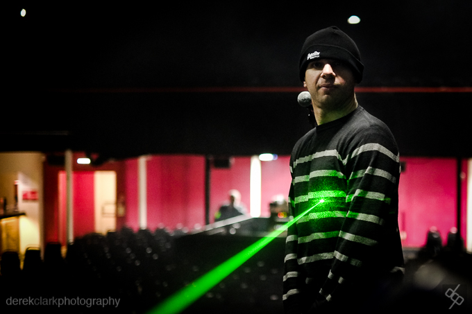


 Welcome to Episode 4. This time round we'll be looking at some shots of a comedian at last years Belladrum Festival in Scotland. I was there as a musician and had a lot of time to kill as we were the last act of the day. Festivals are great places to photograph as you get a huge amount of things going on in a relatively small space. There's live bands, comedians, fire eaters, vendors and some of the craziest humans on the planet! Click


 "War is partly madness, mostly insanity and the rest of it is schizophrenia!"






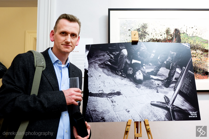
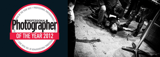 I'm delighted to be a finalist in The Professional Photographer Of The Year Awards. I received an email yesterday confirming I was in the final ten of the News category. A selection of the finalist photographs from all categories will be featured in the April edition of Professional Photographer Magazine (on sale in March) and the winners will be announced at the awards event in Cheltenham at the end of March. You can read more about this shot (taken with my X100) in the previous post